In today’s digital age, traditional marketing methods like flyers are often overlooked. However, flyers are still an effective way to promote your business, product, or event. A well-designed flyer can grab people’s attention, convey your message clearly, and inspire them to take action. But how do you create a flyer that stands out from the crowd? In this article, we’ll cover everything you need to know about creating eye-catching flyers for your business.
The Importance of Eye-Catching Flyers for Business
Flyers are an affordable and versatile marketing tool that can be distributed in a variety of ways. Whether you’re handing them out at events, leaving them in local businesses, or mailing them directly to customers, flyers can help you reach a wide audience. However, with so many flyers out there, it’s important to make yours stand out. An eye-catching flyer can grab people’s attention and make them curious about your business, product, or event. It can also help you make a lasting impression and increase brand awareness.

Flyer Design Basics
When it comes to designing your flyer, there are a few basics to keep in mind. First, consider the purpose of your flyer. Are you promoting a sale, event, or product launch? Next, think about your target audience. What language, imagery, and design elements will resonate with them? Finally, consider the overall look and feel of your flyer. Does it match your brand identity? Is it visually appealing and easy to read? What sort of flyers work for your competition? Have you researched what they do to reach people in a similar way?
Did you know we can do the design for you? Talk to us today.
Choosing the Right Flyer Format and Size
Before you start designing your flyer, you’ll need to choose the right format and size. The most common flyer formats are half-page / A5 and full-page / A4, but there are other options available as well. Your choice will depend on the amount of information you need to include and how much space you have to work with. In addition, consider the size of your audience. If you’re targeting a specific group, such as college students, a smaller flyer may be more effective. However, if you’re promoting a large event or product launch, a full-page flyer may be more appropriate.
Essential Elements of Flyers for Business
Every flyer should include certain essential elements to ensure that it’s effective. These include:
1. Headline: Your headline should be clear, concise, and attention-grabbing. It should convey the main message of your flyer and make people want to learn more.
2. Body Copy: The body copy of your flyer should provide more information about your business, product, or event. It should be easy to read and understand, with short paragraphs and bullet points if possible.
3. Images/Graphics: Images and graphics can help make your flyer more visually appealing and memorable. Choose high-quality images that are relevant to your message and use them strategically. If you need high quality images, we can help you find the right ones.
4. Call-to-Action: Your flyer should include a clear call-to-action that tells people what you want them to do next. This might be to visit your website, call your business, or attend your event. Have you ever used QR codes to benefit your business? Check out our video below and full article. Click here to view article.
[presto_player id=1410]
Creating Effective Headlines and Taglines to grab attention to your Flyer
Your headline and tagline are two of the most important elements of your flyer. They should be attention-grabbing, memorable, and convey your message clearly. When creating your headline, think about what makes your business, product, or event unique. What sets you apart from the competition? What problem do you solve for your customers? Your tagline should be a concise summary of your message that reinforces your headline.
Selecting the Right Images and Graphics
Images and graphics can help make your flyer more visually appealing and memorable. However, it’s important to choose the right images and graphics that are relevant to your message. Avoid using generic stock photos and instead opt for high-quality images that showcase your product, event, or business. If you’re using graphics or illustrations, make sure they’re consistent with your brand identity and don’t overwhelm the rest of your design.
Adding Compelling Call-to-Actions
Your call-to-action (CTA) is what tells people what you want them to do next. It’s important to make your CTA clear, concise, and compelling. Use action-oriented language that encourages people to take action, such as “Visit us today” or “Call now for more information.” Consider using urgency as well, such as “Limited time offer” or “Only a few spots left.” Finally, make it easy for people to take action by including your contact information, website, or social media handles. “Make them an offer they can’t refuse!”
Printing and Distribution Tips
Once you’ve designed your flyer, it’s time to print and distribute it. There are a few tips to keep in mind to ensure that your flyer is effective:
1. Choose high-quality paper: Your flyer should be printed on high-quality paper that’s durable and looks professional. Will it be exposed to the elements? Glossy flyers can resist rain and dirty.
2. Consider colour: Colour can help make your flyer more visually appealing. Consider using colour strategically, such as for your headline or images. It’s good to bring some of your branding colours into the mix.
3. Choose the right distribution method: Consider where your target audience is most likely to see your flyer. Will you hand them out at events, leave them in local businesses, or mail them directly to customers? Why not include offer flyers with greeting cards?
Measuring the Success of Your Flyer Campaign
Once your flyer is out in the world, it’s important to measure its success. This will help you determine whether your message is resonating with your target audience and whether your distribution methods are effective. Consider using unique URLs or phone numbers to track responses (QR codes are great for this), or ask customers how they heard about your business or event. Finally, analyse your results and use them to refine your marketing strategy for future campaigns.
Common Flyer Design Mistakes to Avoid
When designing your flyer, there are a few common mistakes to avoid. These include:
1. Overloading your flyer with information: Your flyer should be easy to read and understand. Avoid including too much information or cramming your design with too many elements.
2. Using low-quality images: Low-quality images can make your flyer look unprofessional and unappealing. Choose high-quality images that showcase your message.
3. Neglecting your call-to-action: Your call-to-action is what tells people what you want them to do next. Make it clear, concise, and compelling.
Tools and Resources for Designing Flyers for Business
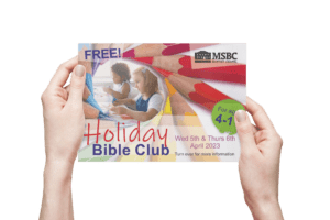
If you’re not confident in your design skills, there are a number of tools and resources available to help you create an eye-catching flyer. Firstly.. contact us! We can design from something as simple as a scrap of paper with pencil ideas. Here is an example of where we did this for a customer.
Alternatively you could use Canva. Canva offers a variety of templates and design elements that you can use to create your own flyer. Adobe Spark and Piktochart are other options that offer similar features. Whatever you do to create your project, talk to us first. That way you won’t have to adjust the files for printing when you think you are finished and the deadline is looming.
Conclusion
Flyers are a versatile and cost-effective marketing tool that can help you reach a wide audience. However, to be effective, they need to be eye-catching and convey your message clearly. By following the tips and strategies outlined in this guide, you can create a flyer that stands out from the crowd and drives results for your business. Remember to consider your target audience, choose the right format and size, use high-quality images and graphics, and include a clear call-to-action. With a well-designed flyer, you can take your marketing efforts to new heights.
Why choose Afford A Print for your flyer print project?
Have a read of some of the reviews left by our happy customers:
